Making Garbage Collection Quick and Convenient, Adding Ease to Your Life!
Redesign - Tainan Environmental Protection App
Development Software
Figma
Team Members
Independent Production
Roles
UI Design, UX Researcher
Date
2024/10


Back To Top
I live in Tainan, and whenever I wait for the garbage truck at the end of my alley, I often hear passersby ask, “Is the garbage truck coming today? What time? Is there a recycling truck?” This scene plays out almost every day, reflecting the public’s reliance on and anxiety about waste collection information.
Although the city government has launched the “Tainan Environmental Protection” app to integrate real-time garbage truck tracking and various environmental services, the user experience has deteriorated over time. As more features were added, the interface became increasingly complicated, making it difficult for users to find the information they need.
After observing these issues, I decided to redesign the app’s real-time garbage truck tracking feature, aiming to optimize the overall information structure and user flow. My goal was to enhance the app’s usability so it could truly serve the needs of Tainan citizens.
Background
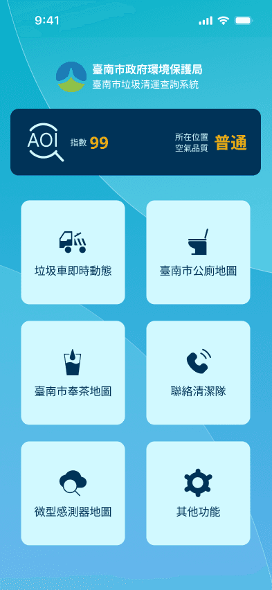
The "Tainan Environmental Protection App" is a government-developed application that offers free services to the public. By providing real-time garbage truck information and other environmental features, it aims to promote social and environmental well-being. As functions were gradually added, the app evolved into a comprehensive environmental platform, but this also led to issues such as complex interfaces and poor user experiences. Therefore, this redesign project focuses on the "Real-Time Garbage Truck Tracker" feature, hoping to improve service quality and convenience by enhancing the user process and interface.
Problems Identified
Unclear Information Hierarchy: The interface structure lacks a clear hierarchy, making it difficult for users to quickly understand and operate.
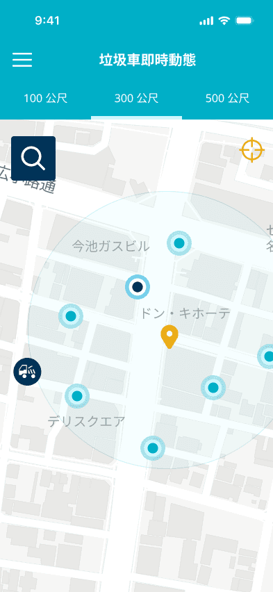
Overly Complex Display of Garbage Truck Locations and Schedules: Excessive icons and cluttered layouts make reading and recognition challenging.
Lack of Consistency in Design Style: Visual elements and interface design lack unified standards, reducing brand recognition and user trust.
Non-Intuitive Arrival and Departure Notifications: Notification methods are too subtle, preventing users from promptly grasping garbage truck movements.
Objectives
Reorganize Interface Information Architecture: Make the interface logic clearer, allowing users to intuitively find the functions they need.
Establish a Unified Visual Style: Enhance overall consistency and professionalism, increasing user trust in the product.
Simplify the Display of Garbage Trucks and Stops: Improve visual layout and information presentation, reducing reading burden.
Integrate Schedules with Arrival and Departure Information: Provide more intuitive dynamic reminders and real-time updates for a better user experience.
Users are not lacking information—but they often struggle to find the one piece that’s relevant to them. This research journey deepened my understanding of the anxiety and usability barriers behind garbage truck information queries. It also clarified a fundamental question: Who are we designing for, and what problems are we trying to solve?
Research & Planning
Starting from Real-Life Context : How I Defined the Nature of “Information Retrieval Difficulty”
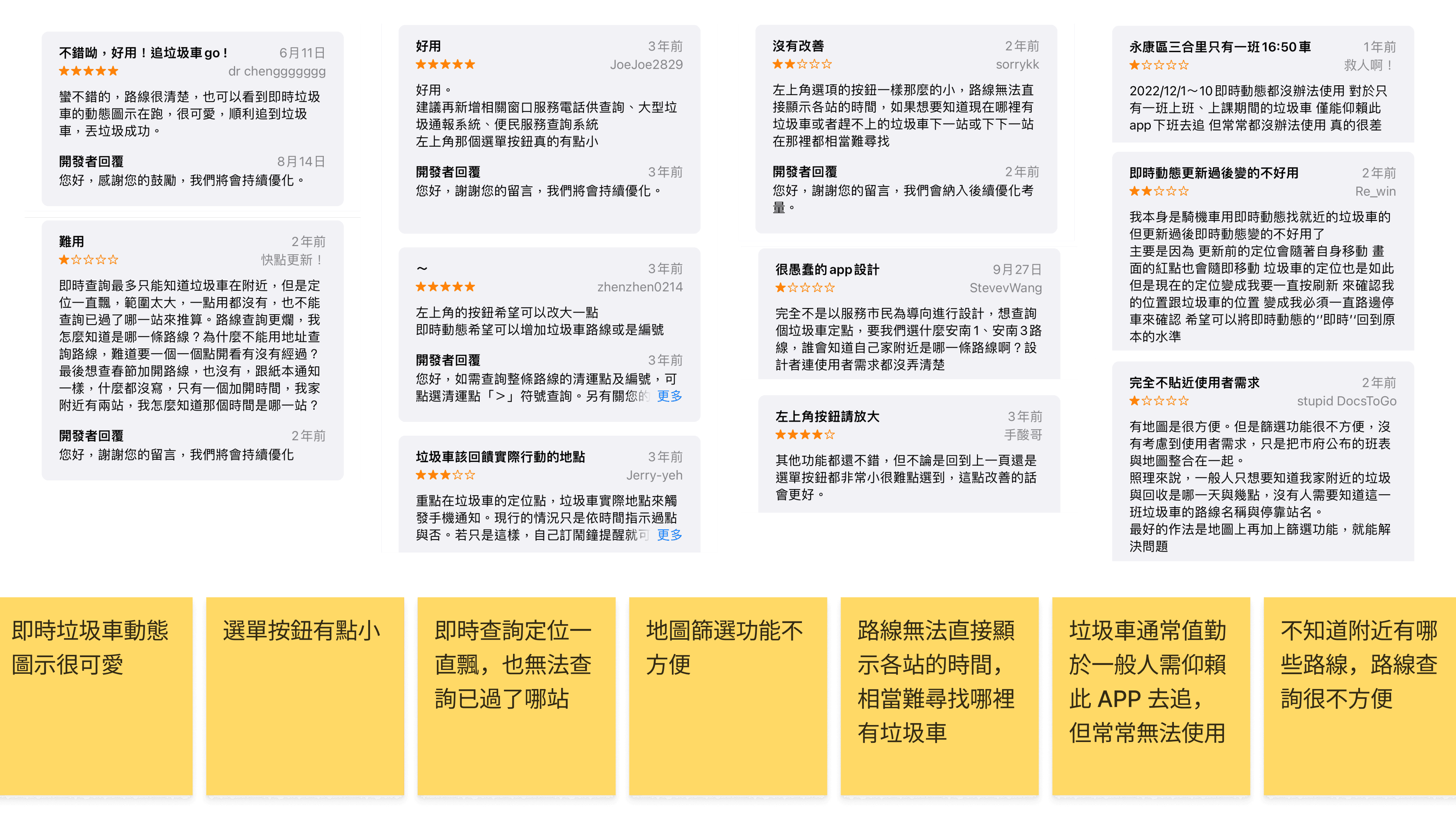
To better understand users’ real pain points, I began by analyzing user reviews from the Google Play Store. Two key insights emerged:
Users want faster and more intuitive access to real-time garbage truck locations and estimated arrival times.
The current app’s workflow is overly complicated. The interface feels cluttered, and icons are hard to recognize. making it difficult to quickly identify relevant information.
Building a User-Centered Perspective : Personas & Journey Mapping
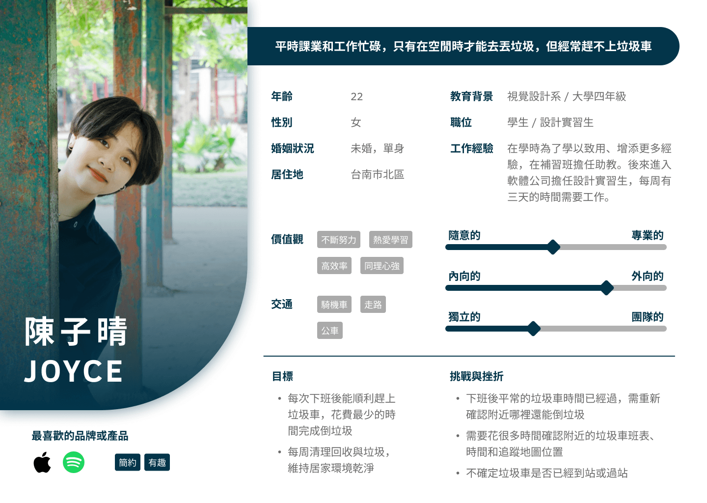
I created two representative personas to reflect different lifestyle needs:
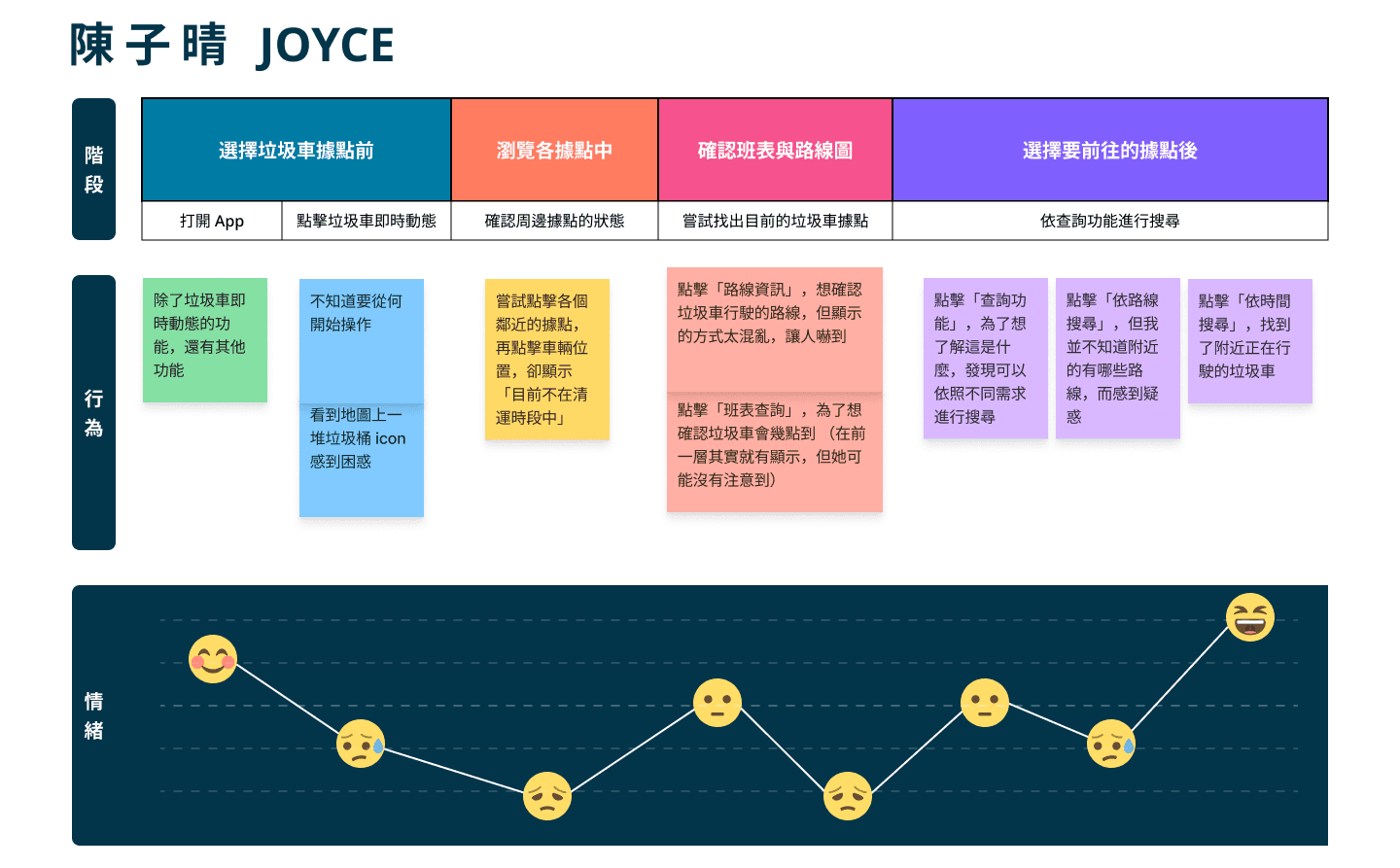
Joyce is a student with a part-time job. Her fragmented schedule and changing locations require a quick way to check where garbage collection is available and whether she can drop off trash on the way.
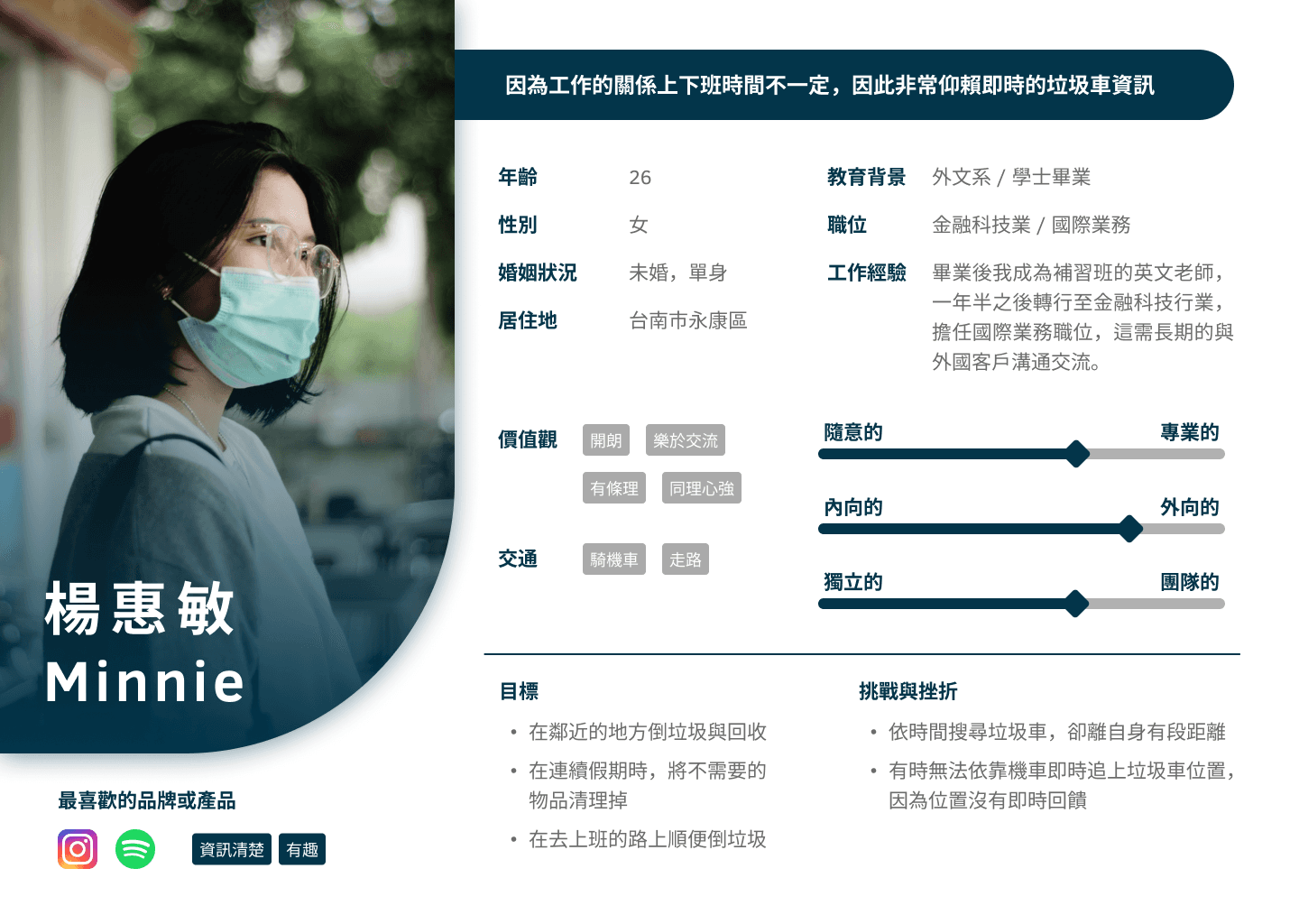
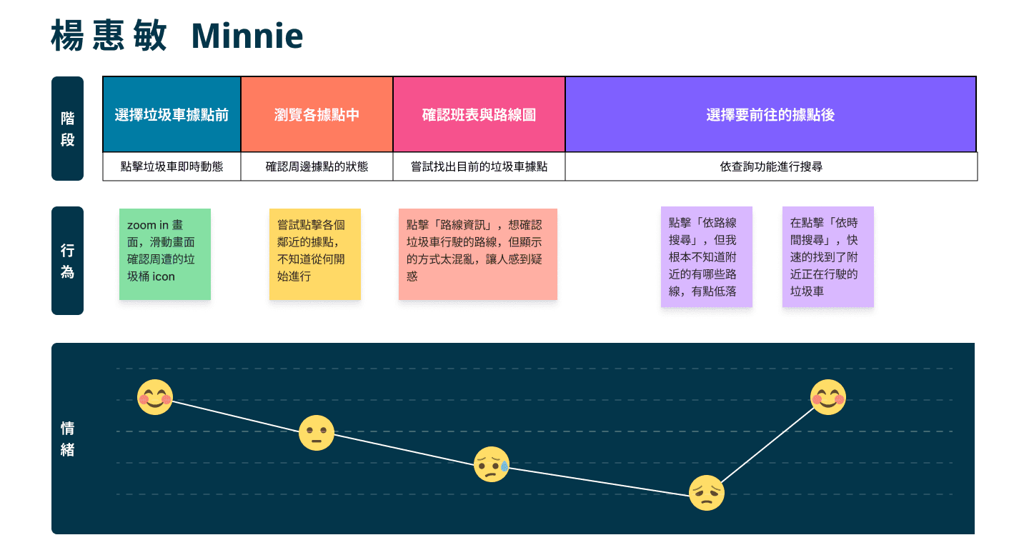
Minnie works at a multinational company. With unpredictable commutes and frequent overtime, she needs a flexible way to track nearby garbage trucks in real time.
Through personas and journey maps, I visualized their emotional states during the app experience:
Users start with high expectations but are quickly overwhelmed by dense icons, chaotic layouts, and unclear route labels.
They often have to make several attempts—or even leave the app—before they can find the right information.
Joyce
Minnie
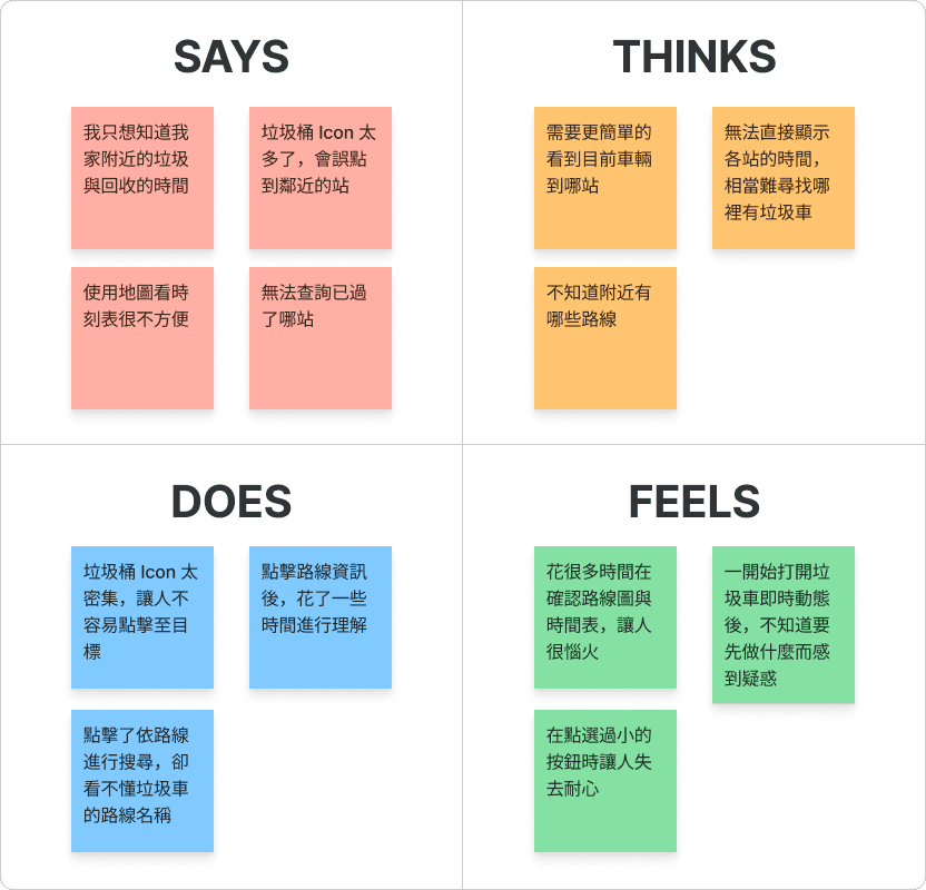
Focusing on Key Pain Points : Empathy Map & User Needs Hypothesis
To identify root problems, I used an empathy map to synthesize users’ feelings and behaviors.
The most common frustrations included:
Difficult-to-read icons and dense visuals: Too many markers and unclear map details made it hard to identify relevant stops.
Unintuitive navigation: Users needed to tap through multiple menus just to understand how to find what they were looking for.
Overcrowded interface: Poor information hierarchy, small fonts, and dense layouts made the screen hard to digest at a glance.
We found that users spend a lot of time confirming information, attempting to click various buttons without clearly understanding their functions, leading to questions during the operation process.
Design Hypothesis
If the interface can automatically locate and clearly display the nearest stop and estimated arrival time, users will be able to take out their trash quickly and without stress.
From Insight to Direction : POV, HMW, and User Story
In today’s fast-paced lifestyle, even a simple task like taking out the trash can become a daily source of anxiety.
I translated these insights into clear design challenges:
POV (Point of View): We are designing for modern individuals who lead flexible, mobile lives, yet still want to maintain a clean living space.
HMW (How Might We):
How might we make the map interface more intuitive?
How might we automatically highlight the nearest garbage truck to reduce user effort?
I further defined the core value of the product with a user story:
“As an office worker with an unpredictable schedule, I need a fast and clear way to check garbage truck information so I don’t miss my only chance to take out the trash each day.”
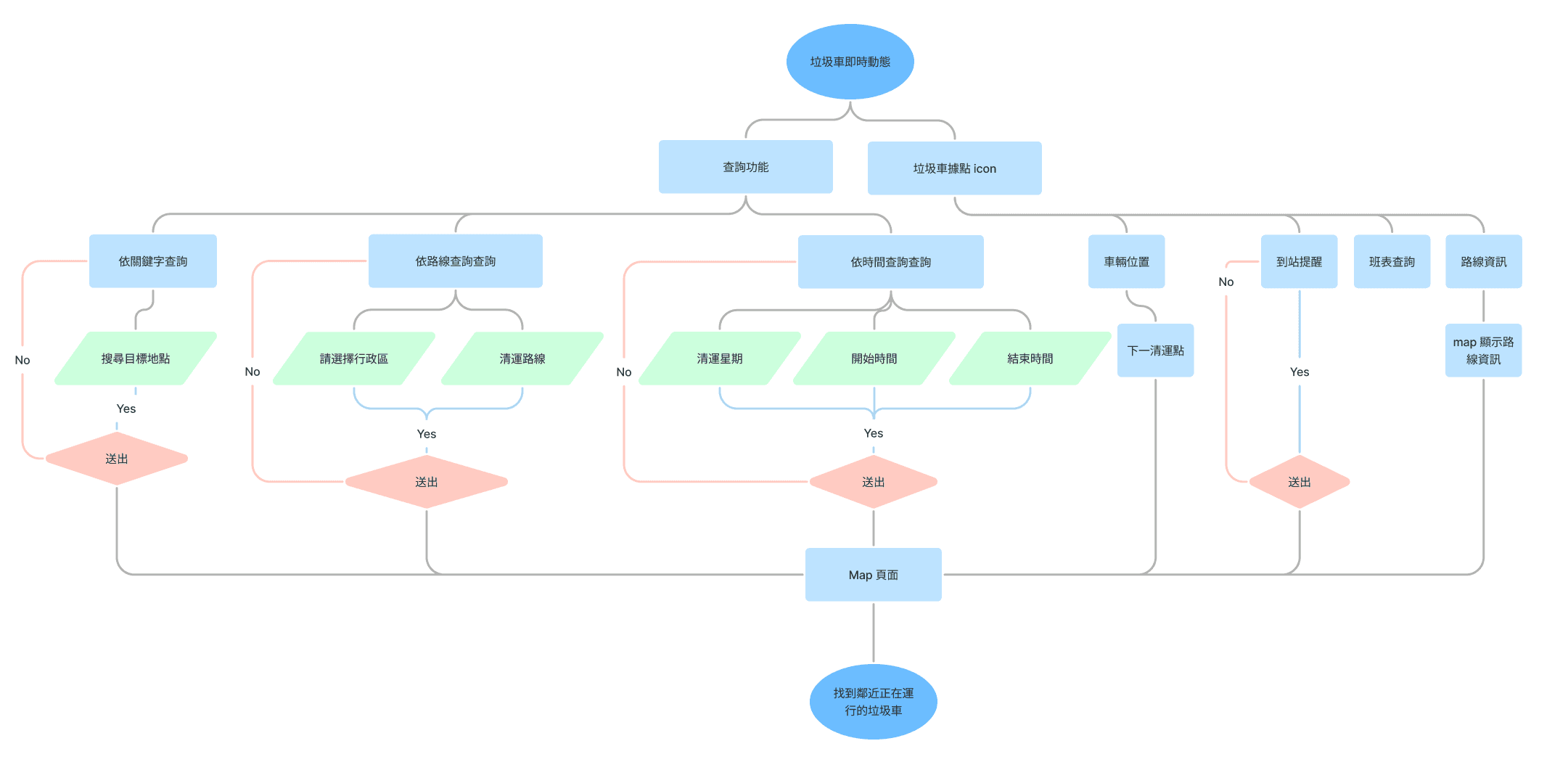
User Flow & Information Architecture
To address the task of “how to quickly check the location of nearby garbage trucks,” I designed a complete User Flow. It maps out the user’s journey after entering the app, showing how different search methods (by time, route, or keyword) lead to the desired information.
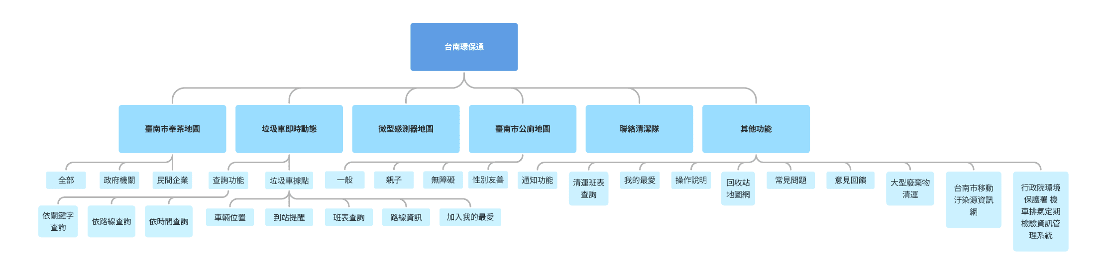
Based on earlier user insights and HMW framing, I restructured the overly complex feature set of the existing app. The original “Tainan Environmental Protection” app included numerous functions, but their categorization lacked clarity. I created a revised Information Architecture (IA) that reorganized features based on service type and user task goals.
User Flow
Information Architecture
Design & Prototyping
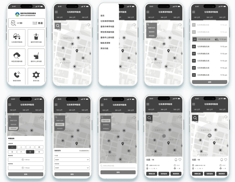
Low-Fidelity Design
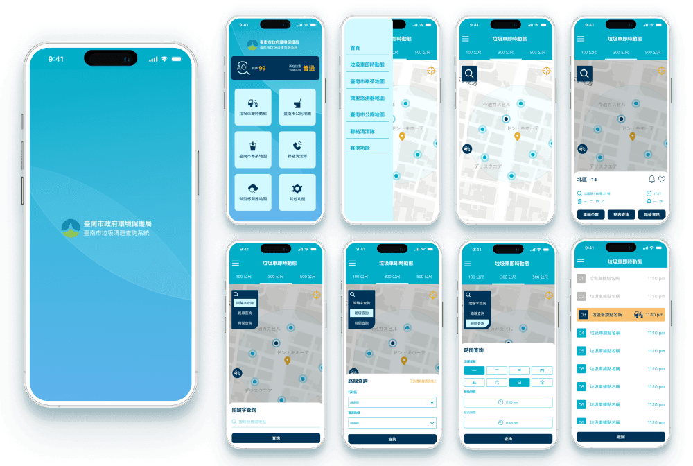
High-Fidelity Design
By providing a personalized meal order history and a transparent food rating system, we help users quickly review their past experiences, reduce decision-making hesitation, and improve satisfaction with food delivery choices.
Refining Information Architecture and Layout Hierarchy
Restructured the app’s information architecture to place the most frequently used features in the most intuitive positions while maintaining a consistent visual style to reduce user confusion.
Simplifying UI Elements and Standardizing Design Consistency
Streamlined screen elements by redesigning icons and ensuring overall uniformity to create a more cohesive and user-friendly interface.
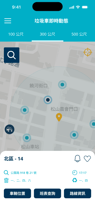
Integrating Garbage Truck Arrival and Departure Information
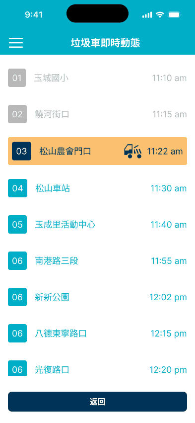
Adopted a list-based display method to present real-time updates for both arrivals and departures on the same interface, allowing users to instantly grasp the next available garbage truck time without toggling between screens. This reduces the cognitive load and enhances overall usability.
Project Reflection: Improving City Life Through Design
This redesign project focused on the real-time garbage truck tracking feature of the Tainan Environmental Protection app—one that closely impacts residents’ daily lives. The goal was to address major issues with the original interface, including information overload and cumbersome navigation.
Through information restructuring, visual refinement, and task flow simplification, I aimed to help residents more easily and confidently access garbage truck information—ultimately improving their waste disposal efficiency and everyday convenience.
Reflections and Challenges
Empathy Gaps and Limited User Interviews
As a self-initiated, solo design project, the number of in-depth user interviews was limited. Some user pain points may not have been fully captured. Expanding the scope of interviews or conducting usability testing in the future would improve the universality and feasibility of the design.
Time and Resource Constraints
Balancing research, user analysis, prototype design, and visual consistency within a self-learning framework required effective time management. In real-world commercial or government projects, additional challenges such as cross-department collaboration, system integration, and regulatory compliance would also need to be addressed.
Technical Feasibility and Data Update Frequency
The Real-Time Garbage Truck Tracker feature relies on backend support to provide live location updates or schedules. This involves data integration with government systems or third-party APIs. As this project focuses on design prototyping, further technical validation and API planning would be necessary for full-scale implementation.
Future Outlook
If this project were to continue:
Expanding Testing and Iterative Improvements
I would expand the scope of user testing to collect real-world usage data, such as the rate of missed garbage pickups, task completion time, and the frequency of accidental taps. These metrics would help guide further refinements in the design.
Ongoing Feature Enhancements
I would establish continuous feedback loops with users, using their input to inform iterative updates. This process would help prioritize features more effectively and ensure the product remains closely aligned with real-life needs—maximizing its overall impact and value.